Designing and Developing a New Website & Brand Identity for an EPC Firm

About the Project
Established in 2011, Bhagirathi Infrapower Projects Pvt. Ltd. (BIPPL) is an ISO 9001–certified EPC leader specialising in turnkey power transmission and distribution. Our partnership focused on elevating their corporate presence to match their massive scale, translating their robust engineering expertise into a sophisticated, modern brand identity. Guided by their new tagline, "We see the world not just as it is, but as it could be," we aimed to position BIPPL as a forward-thinking visionary in India’s infrastructure landscape.
Challenge
As a trusted partner for complex power sector projects, BIPPL needed a visual language that reflected both their technical precision and their ambitious growth. The original branding lacked the digital-first polish required for high-stakes procurement and project management discussions. Our mission was to build a brand architecture that signalled reliability, innovation, and structural integrity, balancing the "heavy" nature of infrastructure with a sleek, modern aesthetic that appeals to government bodies and private stakeholders alike.
Results
We delivered a comprehensive brand ecosystem that reinforces BIPPL’s position as an industry powerhouse. Key outcomes include:
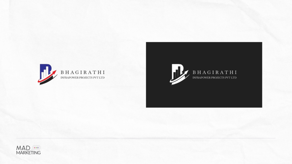
- Logo & Tagline Integration: We redesigned the logo to evoke a sense of momentum and stability, pairing it with the new tagline to emphasise their role in building the future of energy infrastructure.
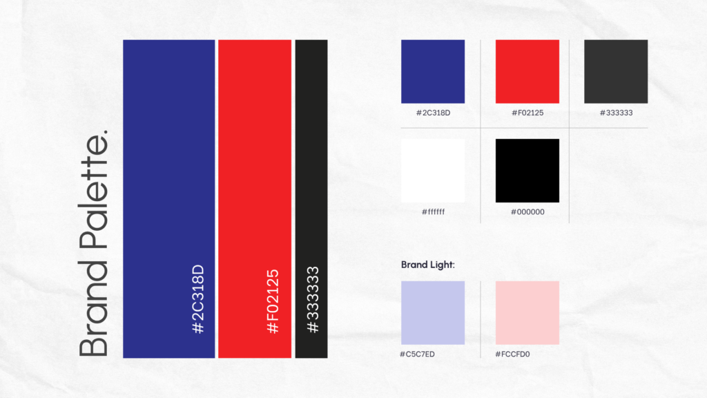
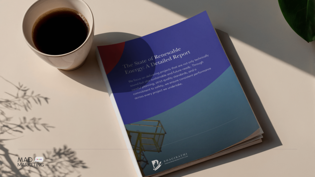
- Colour Palette & Branding: We established a refined colour story that balances industrial strength with modern energy. The palette was selected to convey authority in the EPC sector while ensuring high-contrast clarity across digital and physical collateral.
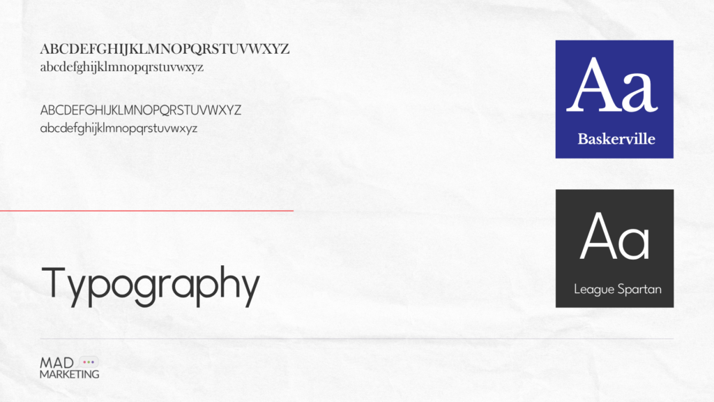
- Typography Selection: To bridge the gap between heritage and modernity, we utilised a modified version of Baskerville for headings to provide a prestigious, established feel. This is balanced by League Spartan for body copy, offering a clean, geometric, and highly legible geometric look.
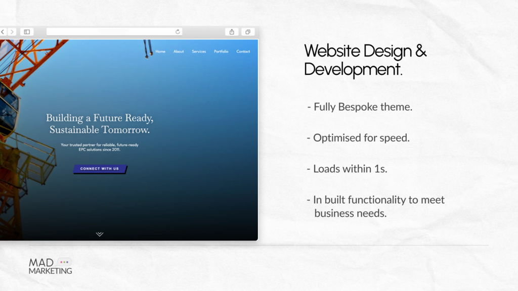
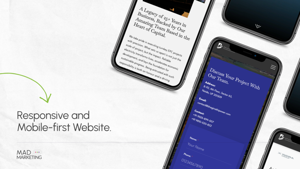
- Digital Infrastructure: The project culminated in a high-performance website designed to function as a professional portfolio. We focused on a clean, structured UI that allows their complex projects to take centre stage, ensuring a seamless user experience for potential partners and investors.

Heartfelt Review From the Client!


-Shanker P. , Founder
Have a Project in Mind? Get in Touch with Us
We will try our best to respond back within 24 hours of your query, and set up an initial meeting with a relevant team member addressing your project details!

Request a Quote for Your Project!