Plastic Surgeon's Brand identity Refresh, SEO & Website
About the Project
Dr Nakul Patel is a highly respected plastic surgeon dedicated to delivering aesthetic excellence and patient-focused care. Our collaboration focused on establishing a premium digital and physical presence that matches the precision of his medical practice. By restructuring his website, refining his visual identity, and implementing a targeted local SEO strategy, we positioned his brand as a top-tier, trustworthy choice for patients seeking specialised cosmetic procedures in Leicester and beyond.
Challenge
In the highly competitive medical and aesthetic space, Dr Patel needed a brand presence that immediately conveyed clinical authority, premium quality, and deep empathy. His original visual assets lacked the cohesion required to appeal to discerning patients, and his digital footprint was not optimised to capture local search demand. The core challenge was to create a flawless, accessible user experience that showcases sensitive patient results professionally while ensuring the practice stands out at the absolute top of search engine rankings.
Results
We engineered a sophisticated, high-performance brand ecosystem that elevates Dr Patel's practice across all patient touchpoints. Key outcomes include:
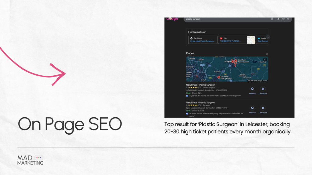
- Search Engine Optimisation (SEO): We executed a robust on-page and technical SEO strategy specifically tailored to the Leicester area. By optimising site architecture, speed, and targeted medical keywords, we successfully boosted his search positions, ensuring he appears at the top of results when prospective patients search for a plastic surgeon in Leicester.
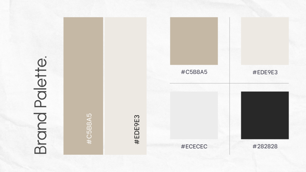
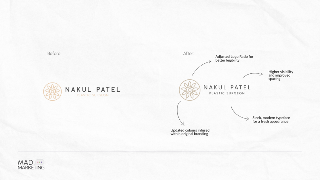
- Logo Redesign & Premium Palette: We modernised his logo and curated an elegant, high-end colour palette using sophisticated tones (including #C5B8A5, #EDE9E3, #282828, and #ECECEC). This clean, neutral, and premium aesthetic evokes clinical cleanliness, luxury, and peace of mind.
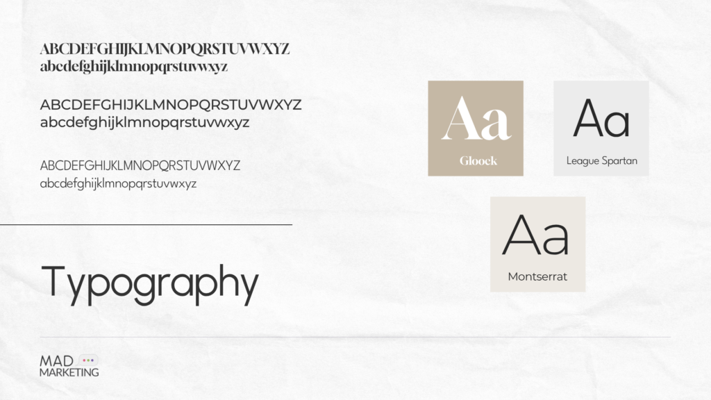
- Three-Tier Typography System: To establish a clear visual hierarchy, we implemented a distinct three-font system. We utilised Gloock for headings to bring an editorial, high-end feel; Montserrat for context and subtitles to maintain sophisticated spacing; and League Spartan for body copy to guarantee highly legible, modern readability.
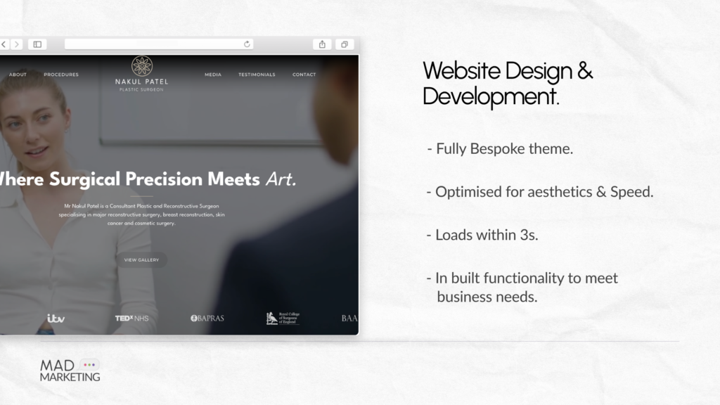
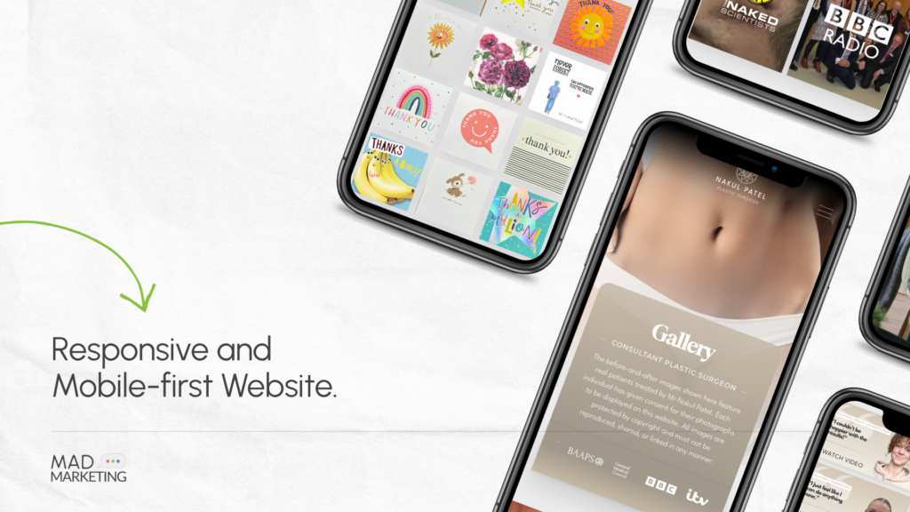
- Patient-Centric Website: The new website was built with full digital accessibility at its core. It features a beautifully structured, professional gallery to showcase patient treatment outcomes alongside comprehensive, easy-to-navigate details for every procedure offered, allowing patients to research safely and comfortably.
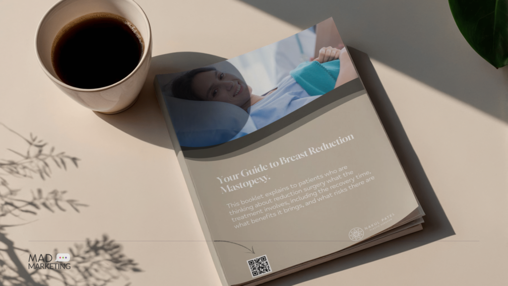
- Physical Brand Identity: To ensure a seamless offline-to-online experience, we translated this refined brand identity onto physical collateral, designing premium business cards, informational leaflets, and consultation brochures for his clinic.

Heartfelt Review From the Client!

-Owner
Have a Project in Mind? Get in Touch with Us
We will try our best to respond back within 24 hours of your query, and set up an initial meeting with a relevant team member addressing your project details!

Request a Quote for Your Project!